Area Under the ROC curve (AUC & ROC)

Area under the curve and Receiver
operating characteristic are terms often used in studies and mentioned in
articles, many of them related to glaucoma. However, for many of us some of these terms
are abstract and appear to give no clue as to what they mean. This post takes a
look at these terms: “Area under the curve” (AUC) and “Receiver operating characteristics”
(ROC). Sometimes a combination term is used:”Area under the ROC curve” (AROC).
AUC ROC is one of the most important evaluation metrics for any classification model’s performance.
- True Positive Rate (TPR)
- False Positive Rate (FPR)
AUC stands for "Area under the ROC Curve." That is, AUC measures the entire two-dimensional area underneath the entire ROC curve.
What is ROC?:
Receiver
Operating Characteristic (ROC) is a proven yardstick to measure the accuracy of
diagnostic tests. The test divides the study population into positive
(diseased) or negative (non-diseased). This is done by finding a cut-off or
threshold which differentiates between diseased and non-diseased (e.g. IOP= 21
mmHg). The ROC Curve tells us about how good the model can distinguish between the two conditions. A good model can accurately distinguish between the two.
Conversely, a poor model will have difficulty in separating the 2 test parameters.

Here, the red distribution represents all the patients who
do not have the disease and the green distribution represents all the patients
who have the disease.
Now
we pick a value where we need to set the cut-off i.e. a threshold value, above
which we will predict everyone as positive (with disease) and below
which will predict as negative (without disease). We will set the
threshold at “0.5” as shown below:

All the positive values above the threshold will be “True
Positives” and the negative values above the threshold will be “False
Positives” as they are predicted incorrectly as positives.
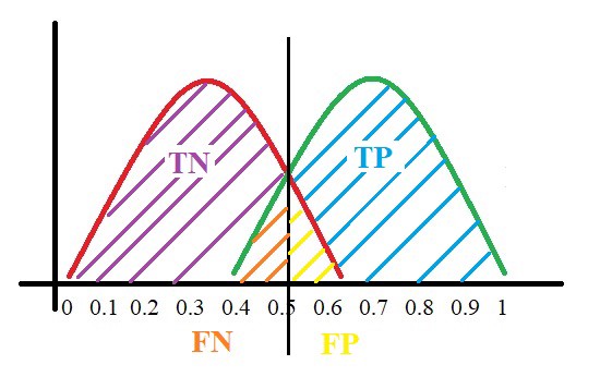
All the negative values below the threshold will be “True
Negatives” and the positive values below the threshold will be “False Negative”
as they are predicted incorrectly as negatives.
Here, we have a basic idea of the model predicting
correct and incorrect values with respect to the set threshold or cut-off.
To plot ROC curve, instead of Specificity we use
(1 — Specificity) and the graph will look something like this:

So now, when the sensitivity increases, (1 — specificity)
will also increase. This curve is known as the ROC curve.
Area Under the Curve:
The AUC is the area under the ROC curve. This score gives us
a good idea of how well the model performs.
Let us take a few examples:


As
we see, the first model does quite a good job of distinguishing the positive
and the negative values. Therefore, in that curve the AUC score is 0.9 as the
area under the ROC curve is large.
If
we take a look at the last model, the predictions are completely overlapping
each other and we get the AUC score of 0.5. This means that the model is
performing poorly and it’s predictions are almost random.
Specificity gives us the True Negative Rate (TNR) and
(1 — Specificity) gives us the False Positive Rate (FPR).
So the sensitivity can be called as the “True Positive Rate” (TPR) and (1 — Specificity) can be called the “False Positive Rate” (FPR).
So now we are just looking at the positives. As we increase
the threshold, we decrease the TPR as well as the FPR and when we decrease the
threshold, we are increasing the TPR and FPR.
Thus, AUC ROC indicates how well the probabilities from the
positive classes are separated from the negative classes.

Limitations:
https://medium.com/greyatom/lets-learn-about-auc-roc-curve-4a94b4d88152

Limitations:
Unfortunately,
diagnostic tests such as ROC have some limitations, such as the test may have a
different sensitivity or specificity for the disease at different stages (for e.g.
the test may give a different diagnostic yield in early glaucoma compared to
advanced glaucoma). It may also be affected by covariates in the studied
population (e.g. age, sex, rural-urban and co-morbidities). In such a mixed
population, a single “pooled” ROC is often used as an average for the
performance of the test. Regression analysis have also been done to assess the influence of covariates on the ROC curves.
REFERENCES:


